What I’ve always loved about working on the Mrs. Fields package designs, whether it be tin, box, tote bag or plush toy (yes! I have, as a graphic designer, now designed small pieces of stuffed animals!), is that every package has been so playful and entirely independent of one another, yet cohesive as whole (whether by season or holiday) and this is due in large part to color palette. Typically, the client gives me a set of 3-4 Pantone colors to work with. With the packages below, I ended up adding 2 addtional colors to the set (orange and yellow).
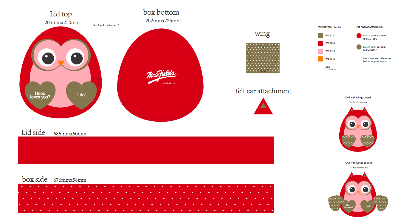
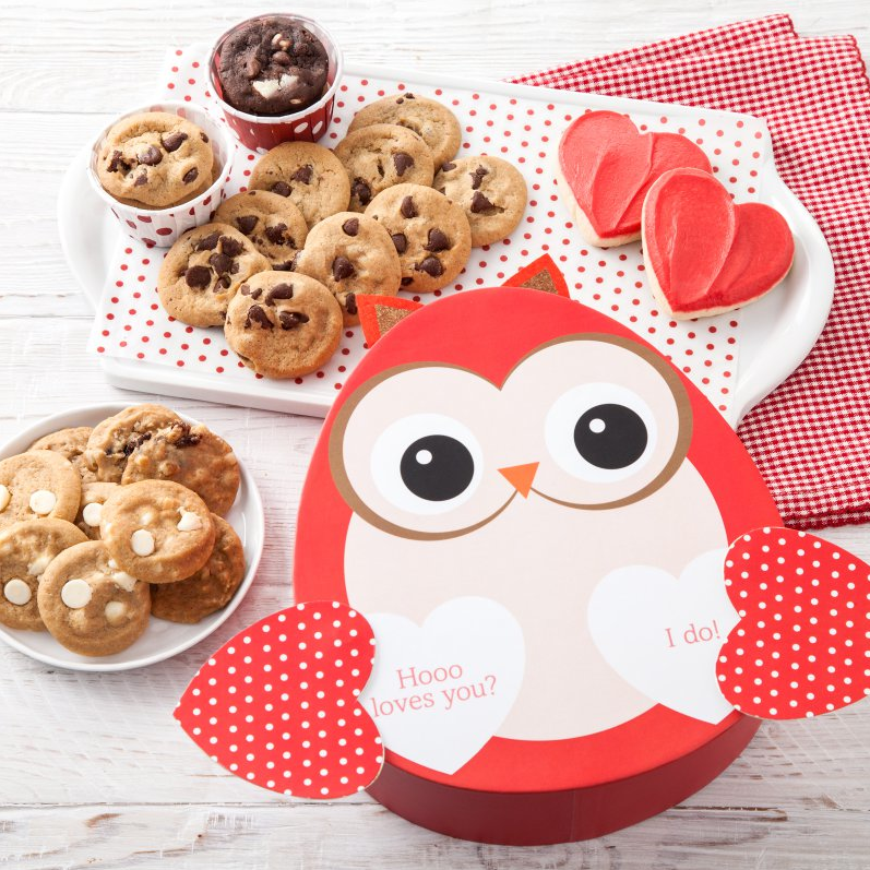
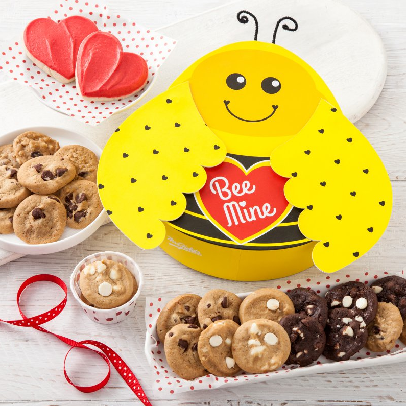
What you’ll see below are two dielines and their printed counterparts. My job, when creating new designs for Valentine’s Day, was to take inspiration from previously designed packages but to give them a new look. Orginally, Fields had wanted a revamped owl (here is their previous design) and ladybug (previous design) but Black Paper (the art director for this project) and I thought a bee could be really fun to try. Fields approved the bee, and this is the reason for the yellow in the Valentine’s Day color palette. A tidbit about the bee: I custom-designed the shape of the wings on this box, specifically for this design. :)
If you’re interested in seeing some versions of the designs below that were part of the iteration process, click here.
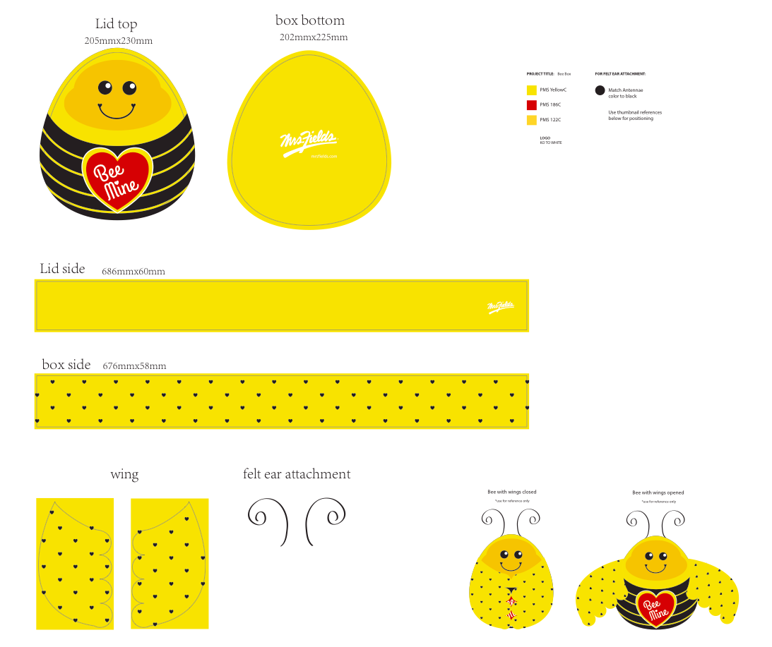
© Christi Willette 2017