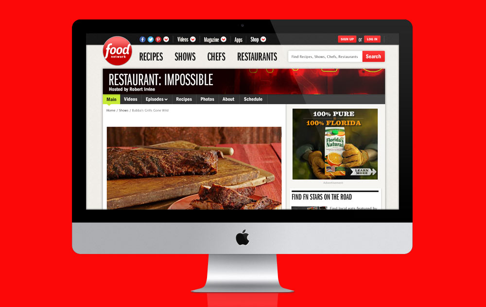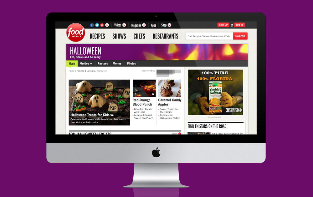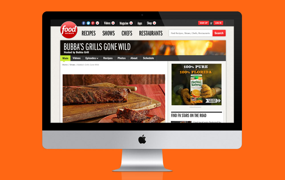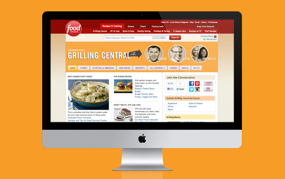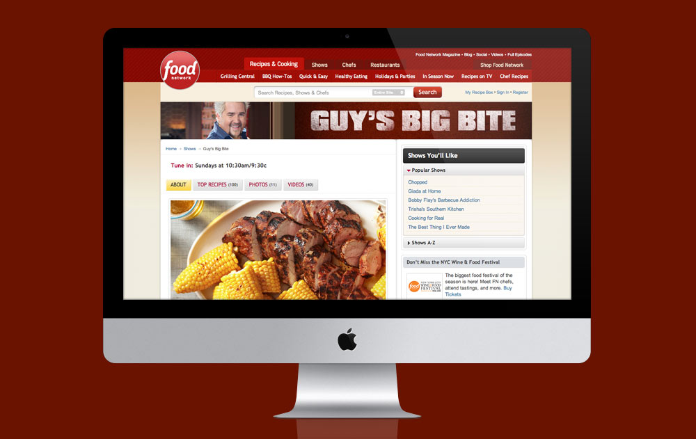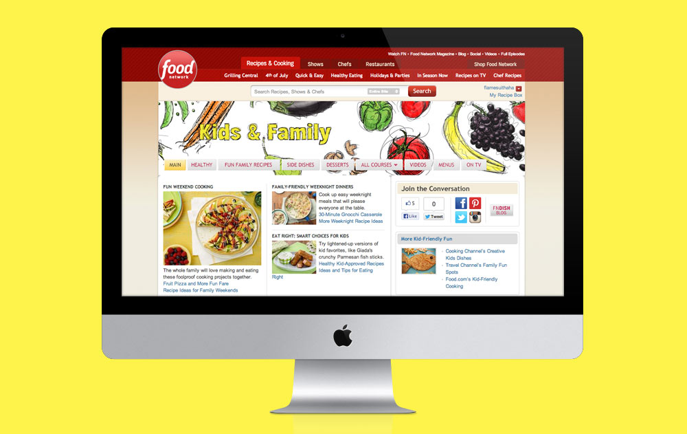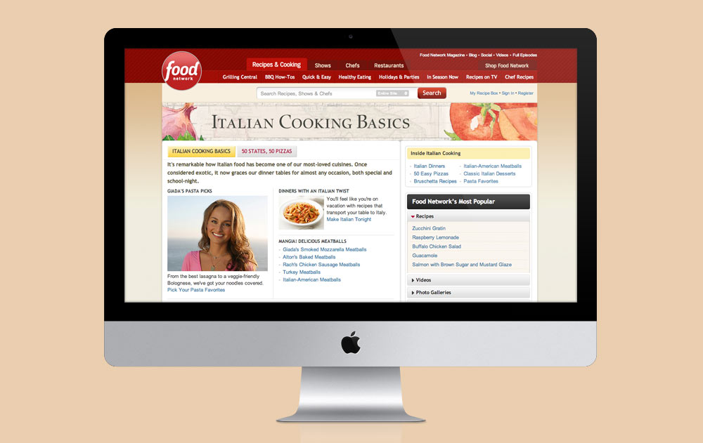
It isn’t necessary to beautify the web with great-looking headers when people go looking for a recipe, but we love our audience and we love our brand and we want to enhance a user’s experience when they visit our site, so we do our best to preface our content with loveliness when someone arrives to peruse a specific collection of recipes.
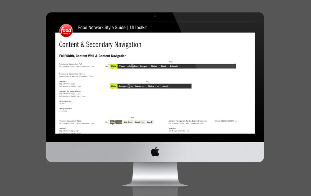
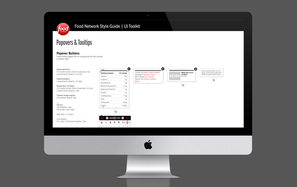
When I first started with Food Network, one of my numerous tasks was creating several different headers for various collections of recipe packages on the brand’s website. Later on in my career I worked on mobile projects and enhancements, but near the end of time there, my career on the digital team sort of came back around and I was tasked with creating headers for the site redesign. This time though, they would become evergreen genre headers that wouldn’t rotate out for every new package or show, like past headers did. To help out further on the redesign, I was involved in the creation of a UI Toolkit that would serve as style guide for web developers to come.